WHIR
STORY
POSITION
BRANDING
Whir is a collective of creatives who do not specialise in any one thing. From music, to clothing, to more typical design projects they offer everything. The brand identity needs to present full flexibility that can work across a range of sectors, showcasing the company's level of versatility, experimentation, and fun.


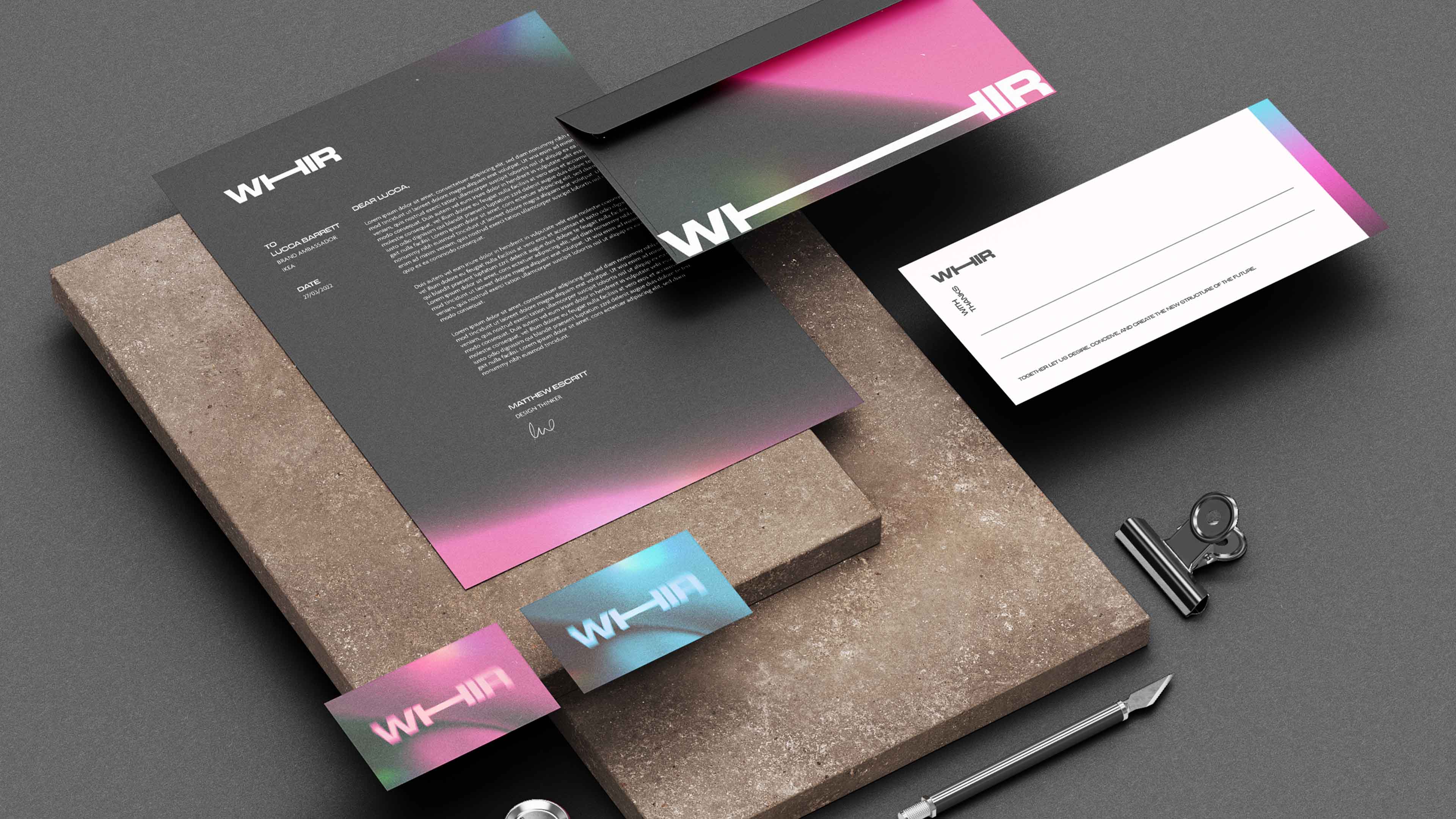
The logo concepts are designed to represent movement. Whir is defined as “something rapidly moving to and fro, or a continuous, regular sound”. This symbolises the brand’s drive to evolve and move forward, shaking up whichever sector it collaborates with.

The final logo focuses on a singular bold, heavy typeface to represent confidence in Whir’s ability. The base logotype is motionless. This is to allow for absolute experimentation. The logo can now take whatever form it needs to evoke the emotion of the project.

Using textures and an open colour palette generates experiences unique to the application. A brand with fewer boundaries is more malleable and inclusive, redefining what an identity needs to look like. If it feels right and has a purpose, it works.


The website homepage utilises the same personality and texture of the brand, but the portfolio of work is clean and pared back in its composition, creating easily digestible content for the user.